At a time when Massive Open Online Courses (MOOCs) were on the rise, one of the top business schools in the country wanted to create their own platform to give their classes true global reach. The school prides themselves on offering a truly unique on-campus educational experience, and wanted to reflect that in it's online classes. For confidentiality reasons I've anonymized the name of the client throughout the text and images.
I was the lead UX designer on this project. Having a background in education, this project was exciting for me, especially in light of the recent surge of MOOCs. Taking cues from the principles of adaptive learning, I wanted to design a platform that was highly interactive, feedback-oriented, and individualized.
Our initial discovery process informed the design of the experience and influenced the initial roadmap and digital strategy. I completed an analysis of the top competitors in the MOOC space, as well as some recent innovators who were disrupting the online education domain.

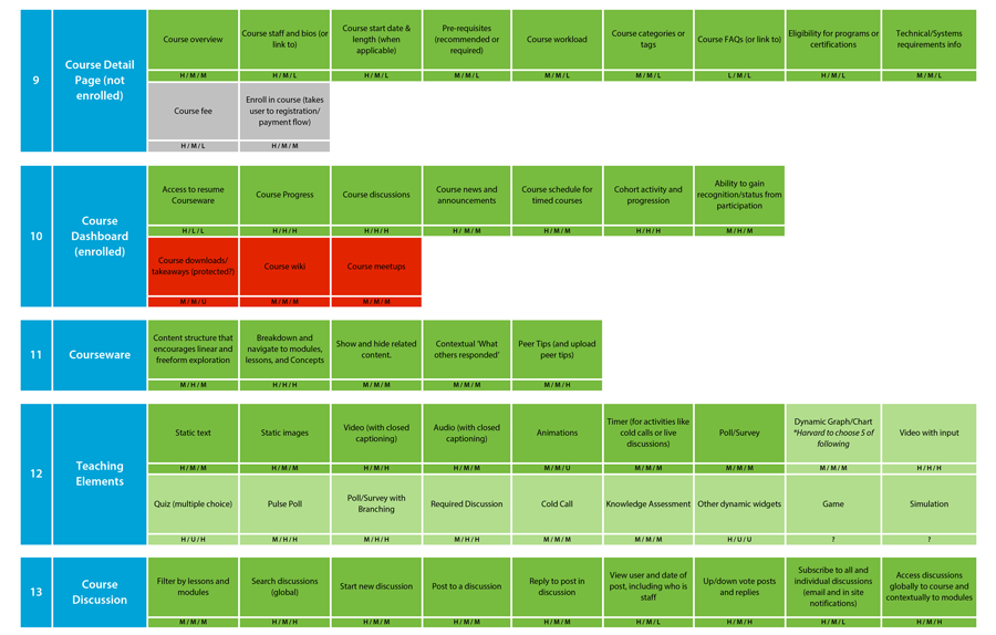
Next, we constructed features within the platform that helped to achieve our goals, and rated the features based on their business value, UX and design effort, and technical complexity. This exercise allowed us to have a holistic view of all the included features and understand the effort, scope and value of each individual feature to inform the project plan moving forward.

From there I defined the framework and began wireframing the rest of the experience. The process was highly collaborative and involved many trips to the school's campus to workshop with the clients. As part of my research I sat in on real-time classes, and got feedback from their professors. Below is a sample of wireframes I created for some of the interactive teaching elements.

I'm a big fan of making quick keynote animations of the wireframes to help clients visualize interactions and transitions. I created this one to show an idea for navigating the course syllabus.
The first program launched with great results. The completion rate, typically in single digits for MOOCs, was just over 85%. Engagement with course materials and with peers was extremely high - all of the students who completed the program regularly submitted analyses and reflections, and a majority of them participated in content discussions with peers. And because the faculty wanted a hands-off approach, we incentivized students to help each other. This worked well, with questions on help discussion boards largely being resolved by students. The program's ability to stand on it's own without intervention from faculty was crucial to it's ability to scale.


